 By definition, shipping is the ultimate offshore industry. For most, the business of shipping is largely invisible, literally beyond the horizon. I recently came across two representations of global shipping – a plot developed from ship’s logs from the 18th and 19th centuries and an animation of a week’s shipping traffic using AIS and satellite technology from FleetMon. It is interesting to see how much and how little has changed over the centuries.
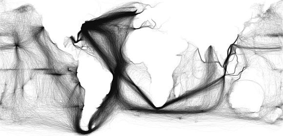
The graphic above, posted on the Big Think blog as “Painted Ships on Painted Oceans: an Accidental Map of the Doldrums” was created by plotting ships’ positions compiled by Lieutenant Matthew Fontaine Maury from 1785 to 1860. One interesting aspect of the plot are the horizontal lines in the Pacific near the Equator, which likely represent ships caught in the doldrums. The Atlantic doldrums seem to be obscured by the shear volume of traffic.
The animation below represents ships traffic as recorded in one week in 2012. While not directly comparable to the plot above, several changes are evident. Obviously with the advent of powered ships, fewer are being caught in the doldrums. The change in traffic resulting from the Suez and Panama canals is obviously also hugely significant. The Southern Oceans have also become correspondingly far less crowded. Thanks to Billy Rudek for pointing out the plot on Facebook.
Global ship traffic seen from space – FleetMon Satellite AIS and FleetMon Explorer
Great post! So interesting to see these mapped out over time.